Vivo Origin OS 6 Meets iOS 26 Vibes
When I watched Vivo’s Origin OS 6 teaser, I did a double take. The interface looks so close to iOS 26’s new Liquid Glass design that for a moment I thought I was on an iPhone. But no—it’s a Vivo phone. And yes, Vivo Origin OS is clearly leaning into Apple’s aesthetic reinvention. This move is bold, interesting, and perhaps more telling of UI trends ahead than many give credit.
Let me walk you through what’s happening, why it matters, and where this might lead.
The Backstory: What Triggered this Design Shift
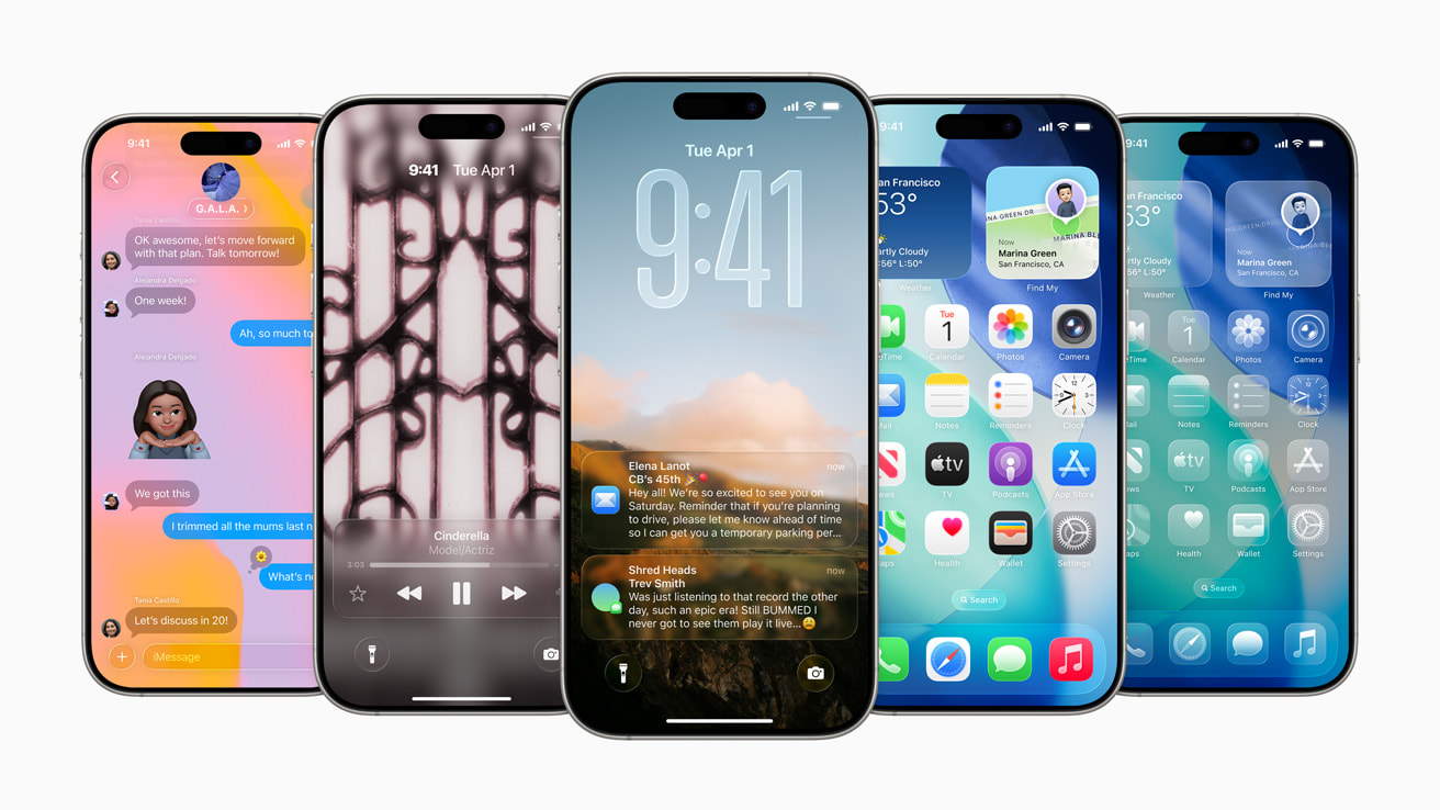
Earlier in 2025, Apple revealed iOS 26, introducing a striking design language dubbed Liquid Glass—glass-like translucency, fluid animations, depth, spatial shifts. It was flush with visual boldness, and immediately got heads turning.
Fast forward to October 10, 2025: Promotional materials and demo videos from Vivo suggest its much-anticipated Origin OS 6 is heavily influenced by the same aesthetic. The timing isn’t a coincidence. The ripple effect began almost immediately.
Decoding the Copy — What Exactly Vivo Copied (and Tweaked)
Let’s break down the design elements in Vivo Origin OS 6 that echo iOS 26’s Liquid Glass — and where Vivo possibly tried to add its own flavor.
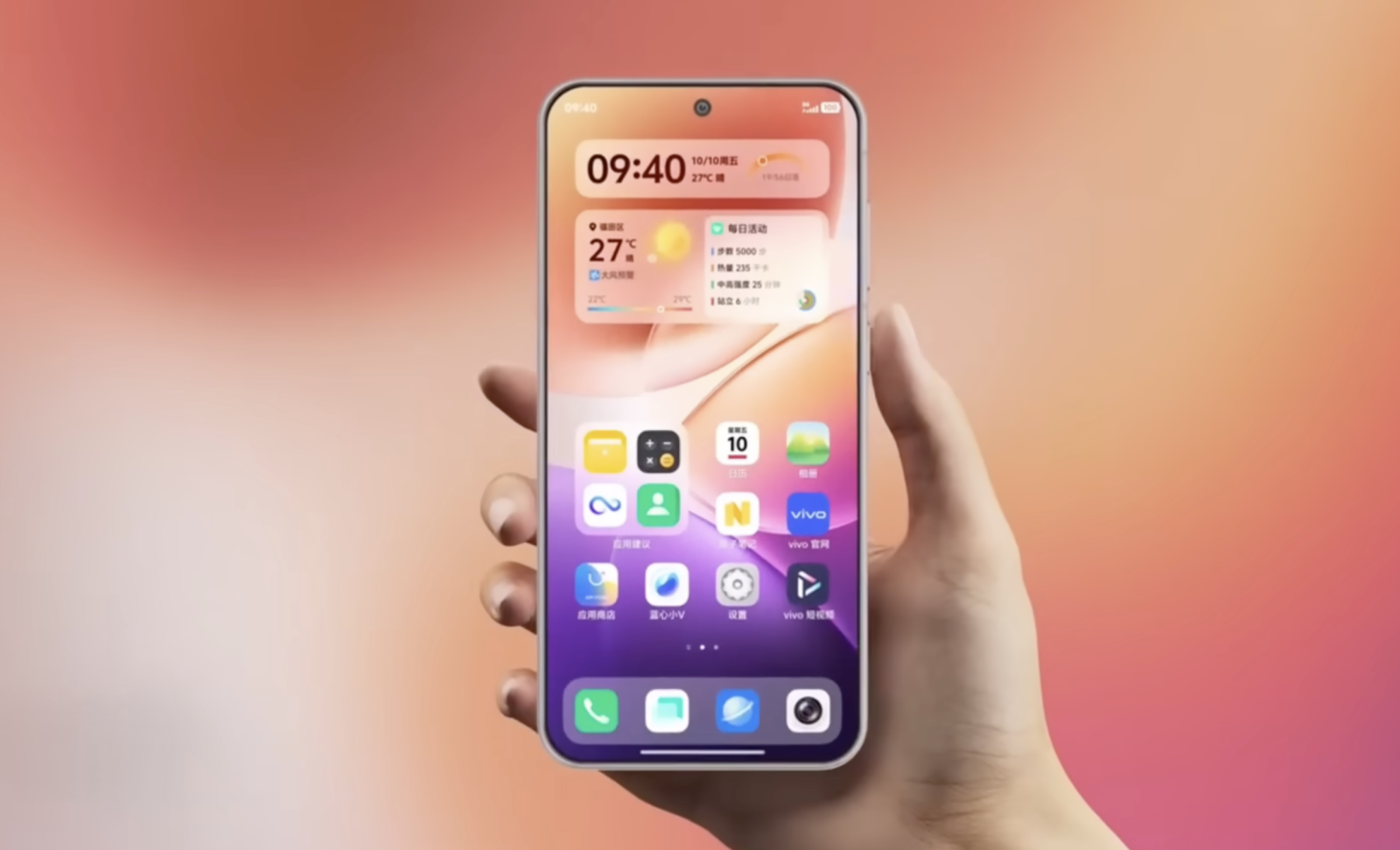
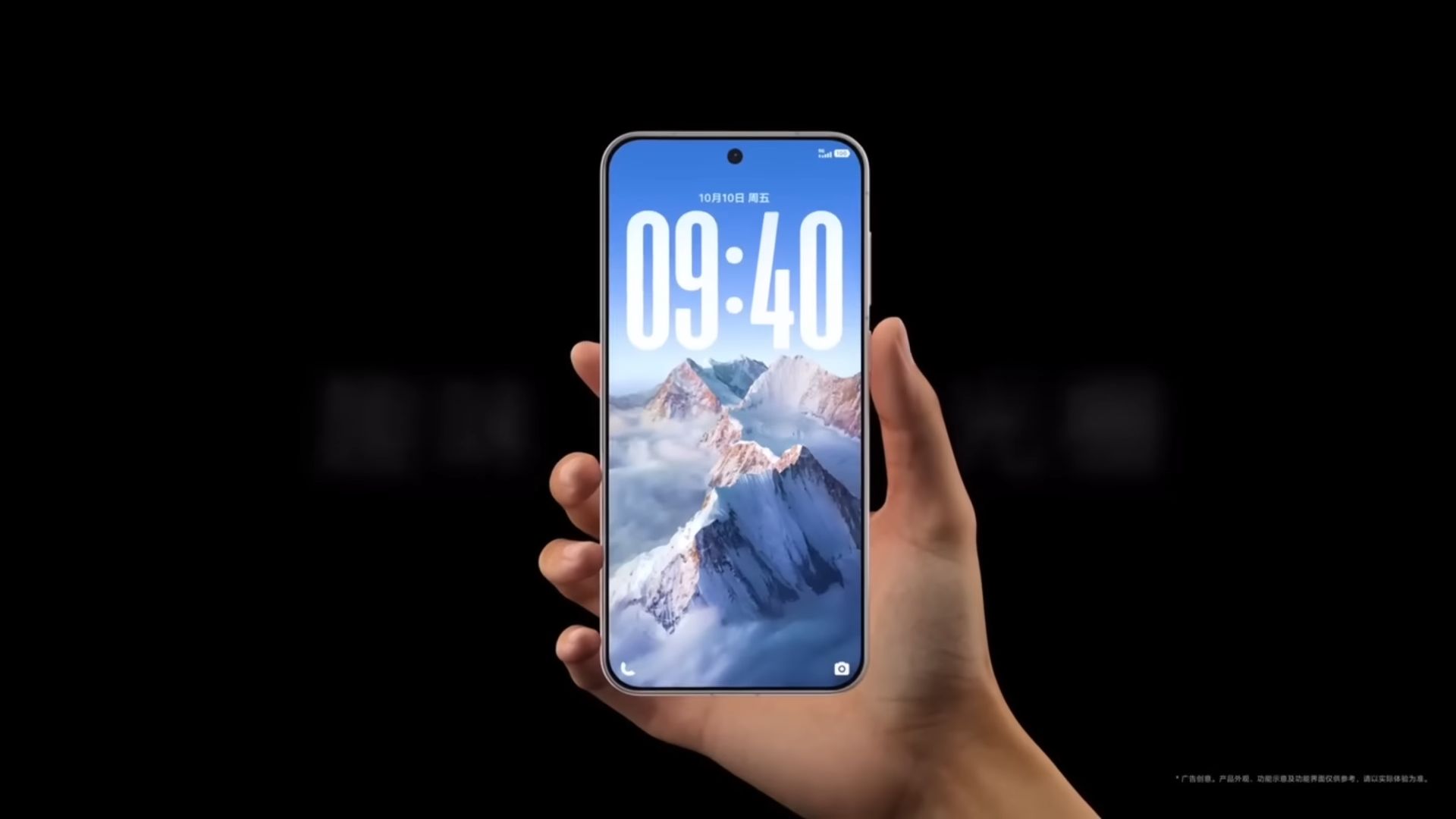
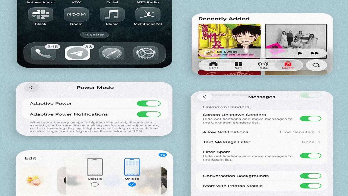
1. Liquid Glass Aesthetic, Front and Center
Rounded, translucent controls, refraction, softened borders — these are textbook Liquid Glass territories. Vivo leans into these heavily, making “glassiness” the central visual theme of Origin OS 6.
2. Translucency Everywhere
We’re talking translucent notifications, folders, docks, buttons. You’ll see through parts of the UI—just like Apple does. It’s not just decoration; it changes how depth and layering feel.
3. Iconography & Widgets: The Familiar Shape
Squircle icons, minimalistic widgets, a clock that feels like it’s floating—these are design choices that mirror iOS 26. Even Vivo’s Control Center (or equivalent quick settings UI) seems to mirror Apple’s style adjustments.
4. Spatial & Motion Effects
Vivo is also adopting dynamic wallpapers and motion-based visuals—elements that shift subtly as you move or scroll. That sense of dimensional depth? Very iOS 26 inspired.
But here’s where Vivo’s marketing leans poetic: in their materials, they talk about water, flow, and motion—“every swipe, scroll, and tap flows like never before.” They’re positioning this not just as a look, but as a feeling.
Why Vivo didn’t Just Call It “Origin OS 26”
I had the same thought: why not call it Origin OS 26? Maybe because that’d be too blatant. Or maybe Vivo wants to leave a bit of creative breathing space. Borrowing aesthetics is one thing; claiming parity might invite more criticism or legal scrutiny. But Lyfted inspiration? That’s where things get interesting.
What this Move Signals for Android Skins & UI Trends
This is not just about copying—this is about signaling. Vivo jumping hard into Liquid Glass suggests a few predictions:
-
Design trends will shift faster. Once one major Android skin embraces a bold new aesthetic, others will feel pressure to follow.
-
Apple’s influence on UI is cyclical. We’ve seen Android elements move to iOS before; now we see the reverse.
-
Brand identity might blur. When interface design converges, differentiation has to come from other features—performance, ecosystem, services.
-
Samsung (One UI 9) is under the spotlight. If any Android skin can push back hard or reinterpret “glass” in its own style, it’s One UI.
Expect brands such as OnePlus, Xiaomi, Oppo, Motorola to respond. The next year or two in UI design is going to be really interesting.
The Risks & Criticisms: When Flame Meets Style
Let’s be real — borrowing aesthetics isn’t new. But there’s a fine line. When designs get too similar, two issues come up:
-
Identity dilution. If every phone feels like an iPhone, where does brand personality live?
-
User fatigue. Overuse of translucency, motion effects, and visual depth can cause cognitive load or even perceptual issues (some early iOS 26 users reported eye strain or dizziness).
-
Copy vs innovation debate. Critics will call it “copying,” which may affect perception. Even if functionally Origin OS 6 adds utility, that narrative sticks.
A smart UI team knows aesthetics must support usability—not just look pretty.
What You (as a User) Should Watch Out For
Since this is your friend giving you heads-up, here’s what I’d personally test or care about:
-
Performance under layered translucency. If animations lag or transparency slows things down, the effect breaks.
-
Readability / contrast. Glass effects tend to reduce contrast. Will text and icons stay legible?
-
Battery impact. More visual effects often mean more GPU/CPU work.
-
Customizability. Can you tone down transparency or simplify effects to suit your eyes?
-
Updates & stability. Early versions may have bugs or oversights. But if Vivo leans into this, updates will matter.
Vivo Origin OS 6 Is Riding iOS 26’s Wave — But with Its Own Spin
Yes, the design resemblance is strong and intentional. But that doesn’t necessarily make it bad—if Vivo can back it with smooth performance, usable tweaks, and meaningful features, Origin OS 6 can still stand on its own.
I’m excited to see how others respond—and whether this is the start of a “Liquid Glass era” across Android. For now, it’s a bold statement: Vivo is saying, “We liked what Apple did. Let’s do something like it—but make it ours.”
")