iOS 26 is here, and it’s not just another tiny security update that pops up in the middle of your work Zoom call. Nope. This one comes with one of the boldest changes we’ve seen in years — the all-new iOS 26 Liquid Glass design. And yes, it’s already got the internet arguing (because of course it does).
Let’s break down what’s new, why some people love it, why others are already googling “how to turn this thing off,” and how you can actually make your iPhone screen less like frosted bathroom glass and more like something you can read without squinting.
What’s The Big Deal About iOS 26 Liquid Glass Design?
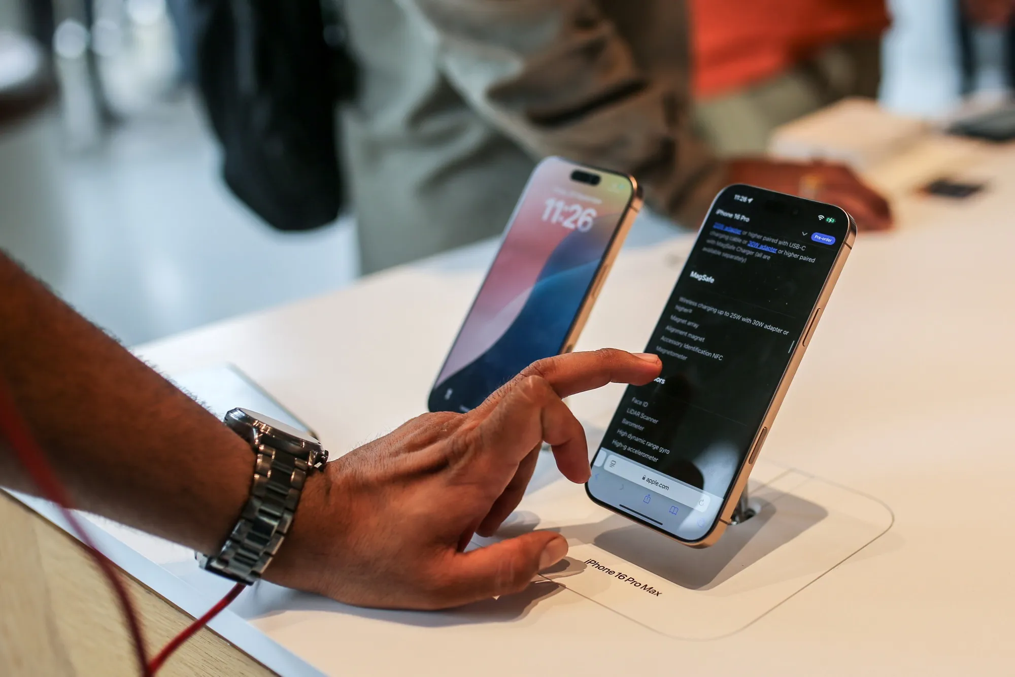
So, here’s the tea. Apple just rolled out iOS 26 to the world (September 17, 2025, if you’re into dates), and the headline feature is this new Liquid Glass theme. Think of it as Apple’s way of saying, “Hey, let’s make everything look super sleek and semi-transparent.”
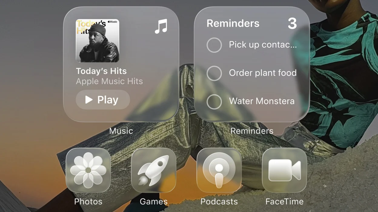
Menus, widgets, even backgrounds now have this faint glassy blur — like looking at your iPhone through a chic cocktail glass. It looks fancy, futuristic, and very Apple-y. But it’s also dividing users faster than a group chat deciding where to order pizza from.
Some users are saying, “This is so modern, my phone feels like a sci-fi gadget.” Others? “Cool, now I can barely read my notifications because everything looks see-through.”
The Internet Reacts — Surprise, We’re All Dramatic
As with any Apple redesign, the online reactions range from memes to mild panic attacks. If you scroll through tech forums or X (yes, it’s still called X), you’ll find half the users praising the aesthetic and the other half desperately searching for the settings menu to turn it off.
The truth? Apple already did tone it down based on beta feedback. The early betas of iOS 26 apparently had even more transparency — but Apple dialed it back before release. Still, for some folks, it’s not enough.
How To Make iOS 26 Liquid Glass Design Clearer (Without Losing Your Mind)
Here’s the good news: you can’t fully remove iOS 26 Liquid Glass design (Apple loves their design decisions too much), but you can make it way easier on your eyes.
Step 1: Reduce Transparency
- Go to Settings → Accessibility.
- Tap Display & Text Size.
- Toggle Reduce Transparency.
Boom. The see-through elements get toned down big time, menus get darker, and suddenly your text isn’t blending into the background like it’s auditioning for a spy movie.
Step 2: Increase Contrast
While you’re in that same menu, flip the switch for Increase Contrast. This one adds a white outline to different UI elements and makes them stand out from the background. Combine it with Reduce Transparency and you get the least “liquid” look possible without ditching the update entirely.
Step 3: Fix Your Home Screen Icons
If you’re not feeling those slightly faded app icons, long-press your home screen, hit Edit, pick the Tinted option, and toggle Increase Contrast there too. You’ll get bolder, more solid-looking icons.
iOS 26 Isn’t Just About Liquid Glass (But Yeah, It’s the Main Event)
This update is rolling out to pretty much every iPhone since the iPhone 11 series, plus both SE generations. And if you’re buying the shiny new iPhone 17 or iPhone Air, you’ll get iOS 26 right out of the box.
But let’s be honest, the Liquid Glass design is what everyone’s talking about — love it or hate it. It’s a reminder that Apple is still willing to take bold swings with UI design, even if it means a few thousand Reddit threads complaining about “too much blur.”
Final Thoughts — Chill, It’s Not The End Of The World
Look, change is always a little uncomfortable — whether it’s Apple redesigning iOS or your favorite coffee shop suddenly deciding to stop serving caramel syrup (true story, still not over it). If you love the new design, enjoy that futuristic look. If you hate it, you now know exactly how to tame it.
The good news? Apple listens. They already tweaked the transparency based on beta feedback, so who knows — by iOS 26.1, we might get even more customization options.
For now, grab your iPhone, tweak those settings, and make your screen look the way you like it. Because at the end of the day, your iPhone should work for you, not make you feel like you’re looking through a foggy window.
")